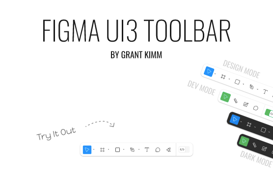
Figma’s New UI
At Config 2024, a new UI for Figma Design was introduced. It featured a less boxy layout with resizable floating side panels, and most notably, a floating toolbar that moved to the bottom of the screen.

As with any change, it will take some time getting used to. It is nice to hear that Figma did their user research on their UI3 concepts and thought through the most relevant places to move existing elements. Designing for designers is sure to be a challenge.
At first glance using it, things still make sense and most everything feels familiar. Icons look similar and are where you’d expect them to be.
What are your thoughts on UI3? Leave a comment.
I also decided to explore the new toolbar, creating a UI3 community file that demonstrates the designer toolbar, dev mode and dark modes. Feel free to use it in your project!
